Auto Fit for Multi-Resolution
Cocos Creator still provides the solution to adapting to screens with various resolutions with one set of assets. Generally speaking, we realize the adaptation scheme for multi-resolution through the following technology:
- Canvas component immediately obtains the actual resolution of the device screen and appropriately adjusts the size of all the render elements in the scene.
- Widget component add to UI nodes. It can align the element with different referential positions of the target node(e.g. the default is the parent node) according to different needs.
- Label component has a built-in function that provides various dynamic layout modes. When the bounding box of labels change because of the alignment requirement of the Widget, labels will present the perfect layout effect according to your needs.
- Sliced Sprite provides images whose size can be arbitrarily designated. Simultaneously, it can meet various alignment requirements and display images with high definition on screens of any resolution.
Next, start off by getting to know the concepts of design resolution and screen resolution, then we will go on to learn the zooming in/out function of the Canvas component.
Design resolution and screen resolution
Design resolution is the resolution sample used by content creators when creating the scene. But screen resolution is the actual resolution of the device that the game is running on.
Normally, design resolution will use the screen resolution of the device that is being used the most by the targeted group on the market, such as: screen resolutions of 800x480 and 1280x720 that are being used by Android devices currently, or screen resolutions of 1136x640 and 960x640 that are being used by iOS devices. Therefore, after designers or directors set up the scene by using design resolution, the game will automatically adapt to the device used by the major targeted group.
Then when the design resolution is different from the screen resolution, how could Cocos Creator adapt to the device?
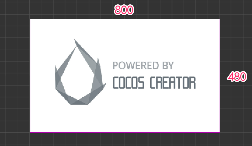
Supposing the design resolution is 800x480, designers will create a background image of the same resolution.
When design resolution and screen resolution have the same aspect ratio
When design resolution and screen resolution have the same aspect ratio, supposing the screen resolution is 1600x960, enlarging the background image to 1600/800 = 2 times will perfectly fit the screen. This is the simplest situation, which will not be discussed in detail here.
When the aspect ratio of design resolution is more than that of screen resolution, the height should be adjusted to avoid black borders
Supposing the screen resolution is 1024x768, a red frame is used in the following picture to indicate the visible area of the device screen. We use Fit Height mode provided by the Canvas component to make the height of the design resolution automatically cover the height of the screen, i.e., enlarging the scene image to 768/480 = 1.6 times.
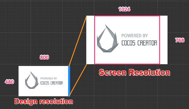
This is a fairly good adaptation mode when the aspect ratio of the design resolution is more than that of the screen resolution. As illustrated above, although some parts of the background image will be cut down on the two sides of the screen, it can be ensured that no goof or black borders will appear in the visible area of the screen. Then the position of UI elements can be adjusted by the Widget, which makes sure that the UI elements will appear in the visible area of the screen. We will introduce this in detail in the next section, the Widget Align documentation.
When the aspect ratio of the design resolution is less than that of screen resolution, the width should be adjusted to avoid black borders
Supposing the screen resolution is 1920x960, a red frame is also used in the following picture to indicate the visible area of the device screen. We use Fit Width mode provided by the Canvas component to make the width of the design resolution automatically cover the width of the screen, i.e., enlarging the scene to 1920/800 = 2.4 times
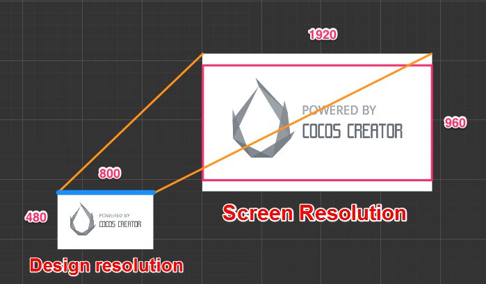
When the aspect ratio of the design resolution is relatively small, the use of this mode will cut down some parts of the background image on the upper/lower sides of the screen.
No matter how much the aspect ratio of the screen is, all the contents of design resolution will be completely displayed, and black borders are permitted
In the last example, supposing the screen has a resolution of 640 x 960. If you want to make sure the background image is completely displayed on the screen, you need to simultaneously open Fit Height and Fit Width in the Canvas component. The zooming in/out proportion of the scene image is calculated according to the smaller dimension in the screen resolution. In the example in the following picture, because the aspect ratio of the screen is less than 1, the zoom ratio will be calculated based on the width, that is, 640/800 = 0.8 times.
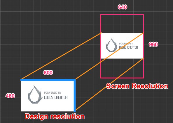
Under such a displaying mode, there might be black borders on the screen or scene image that exceed the design resolution (goof). Although developers try their best to avoid black borders in general, if you want to make sure all the contents within the scale of design resolution are displayed on the screen, use this mode too.
According to the screen aspect ratio, Fit Width or Fit Height will be automatically selected
If there is no strict requirement for the content that may be cropped down on the four sides of the screen, you can not enabled any adaptation mode in the Canvas component. At this time, Fit Width or Fix Height will be automatically selected according to the screen aspect ratio to avoid black border. In other words, when the aspect ratio of the design resolution is more than the screen resolution, Fit Height will be automatically opened (as in the first picture above); when the aspect ratio of the design resolution is less than the screen resolution, Fit Width will be automatically opened (as in the second picture above).
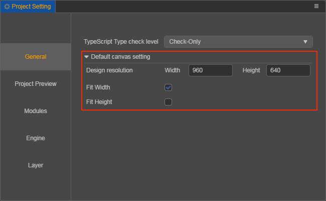
Design resolution can only be configured in the project settings
The current design mode does not allow multi-resolution coexistence, so the design resolution of multiple Canvas in the project still uses the same set of design resolution and adaptation scheme, and you can configure it in Project -> Project Setting -> General -> Default canvas setting.
