Slider Component Reference
Slider is a component for the production of UI components such as volume adjustment.

Click the Add Component button at the bottom of the Inspector panel and select UI/Slider to add the Slider component to the node.
To use Slider, please refer to the Slider API documentation and the Slider scene of the test-cases-3d project.
Slider Properties
| Property | Description |
|---|---|
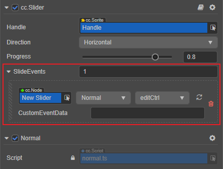
| Handle | The button part of the Slider that allows to adjust value by sliding the button |
| Direction | The direction of the slider, including Horizontal and Vertical |
| Progress | Current progress value, the value range is 0 ~ 1 |
| SlideEvents | Slider component event callback function |
Slider Event

For event structure you can refer to the Button documentation.
The Slider event callback has two parameters, the first one is the Slider itself and the second is the customEventData.
Detailed Explanation
The Slider is usually used to adjust the value of the UI (for example, volume adjustment), and its main component is a slider button, which is used for user interaction. You can adjust the value of the Slider through this part.
Usually a Slider node tree as shown below:

Add a callback by script code
Method one
The event callback added by this method is the same as the event callback added by the editor, all added by code. First you need to construct a EventHandler object, and then set the corresponding target, component, handler and customEventData parameters.
import { _decorator, Component, Event, Node, Slider, EventHandler } from 'cc';
const { ccclass, property } = _decorator;

@ccclass("example")
export class example extends Component {

    onLoad () {
        const sliderEventHandler = new EventHandler();
        // This Node is the node to which your event processing script component belongs
        sliderEventHandler.target = this.node;
        // This is the script class name
        sliderEventHandler.component = 'example';
        sliderEventHandler.handler = 'callback';
        sliderEventHandler.customEventData = 'foobar';

        const slider = this.node.getComponent(Slider);
        slider!.slideEvents.push(sliderEventHandler);
    }

    callback(slider: Slider, customEventData: string) {
        // The event here is a Touch Event object, and you can get the send node of the event by event.target
        // The customEventData parameter here is equal to the "foobar" you set before
    }
}
Method two
By slider.node.on('slide', ...) way to add.
// Suppose we add event handling callbacks to the onLoad method of a component and perform event handling in the callback function

import { _decorator, Component, Slider } from 'cc';
const { ccclass, property } = _decorator;

@ccclass("example")
export class example extends Component {

    @property(Slider)
    slider: Slider | null = null;

    onLoad () {
       this.slider!.node.on('slide', this.callback, this);
    }

    callback(slider: Slider) {
        // The parameter of the callback is the Slider component. Note that events registered this way cannot pass "customEventData"
    }
}