Extending the Assets Panel
Extending the Right-Click Menu
The right-click menu display mechanism is to get the live menu data before it is displayed. The extension pre-registers the assets module in its own package.json to get the right-click menu display events for the Assets panel, and returns the menu data to be displayed via the events, and then displays it uniformly. The registered menu is usually displayed after the existing menu.
Assuming a location (where) in the Assets panel has a right-click menu event, the currently supported extended locations (where) are:
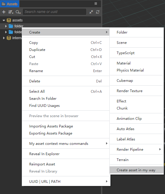
createMenu-- two entry points for creating assets: one is the + button in the top left corner of the panel; the other is the Create option in the right-click menu.dbMenu-- the asset database root nodeassetMenu-- asset general nodepanelMenu-- blank area of the panel
Specific implementation steps:
Select Extension --> Create Extension in the menu bar at the top of the editor and create a new extension in the Global/Projects directory as needed. The extension package will then be generated in the
extensionsdirectory of the root/project directory.Open the
package.jsonfile of the extension package and configure thecontributions.assets.menuproperty, wheremethodsis introduced into theassets-menu.jsfile. Other properties such ascreateMenuare explicit declarations ofwhereabove, and the correspondingonCreateMenuis the method exported fromassets-menu.js:json5// package.json { contributions: { assets: { menu: { methods: '. /assets-menu.js', // This file is in the following demo example createMenu: 'onCreateMenu', assetMenu: 'onAssetMenu', dbMenu: 'onDBMenu', panelMenu: 'onPanelMenu', }, }, }, }The
assets-menu.jspart of the code example in the Demo example at the end of the article is as follows:javascript// assets-menu.js exports.onCreateMenu = function (assetInfo) { return [ { label: 'i18n:extend-assets-demo.menu.createAsset', click() { if (!assetInfo) { console.log('get create command from header menu'); } else { console.log('get create command, the detail of diretory asset is:'); console.log(assetInfo); } }, }, ]; }; exports.onAssetMenu = function (assetInfo) { return [ { label: 'i18n:extend-assets-demo.menu.assetCommandParent', submenu: [ { label: 'i18n:extend-assets-demo.menu.assetCommand1', enabled: assetInfo.isDirectory, click() { console.log('get it'); console.log(assetInfo); }, }, { label: 'i18n:extend-assets-demo.menu.assetCommand2', enabled: !assetInfo.isDirectory, click() { console.log('yes, you clicked'); console.log(assetInfo); }, }, ], }, ]; };The
onCreateMenu(assetInfo)function inassets-menu.jsand similar functions are described as follows:Parameter
assetInfoObjectdisplayNameString - the name of the asset to be displayedextends(optional) String[] - the class to inherit fromimporterString - the name of the importerisDirectoryBoolean - whether it is a folderinstantiation(optional) String - will carry this extension name if the virtual asset can be instantiated as an entityimportedBoolean - whether the import is completeinvalidBoolean - whether the import is failednameString - the name of the assetfileString - the absolute path to the disk where the asset file is locatedredirectObject - jump to the assettypeString - the asset typeuuidString - the asset ID
readonlyBoolean - whether to be read-onlytypeString - asset typeurlString - the address of the asset starting with db://uuidString - asset ID
Return Value
MenuItem[],MenuItemObjecttype(optional) String - optional, normal, separator, submenu, checkbox or radiolabel(optional) String - the text displayedsublabel(optional) String - the secondary text displayedsubmenu(optional) MenuItem[] - the submenuclick(optional) Function - the click eventenable(optional) Boolean - whether it is available, if not it will be grayed out stylevisible(optional) Boolean - whether to showaccelerator(optional) String - Show shortcut keyschecked(optional) Boolean - whether checked when type ischeckbox/radio
More properties can be found in the data format of the electron menu-item documentation.
The effect of implementing the extension is illustrated as follows:
Extending Drag-and-Drop Recognition
Recognizing an acceptable type requires the support of the editor UI component <ui-drag-item>, where an important property is type, <ui-drag-item type="xxx">. Customize a drag-in type and inject it into the Assets panel's scope. If a <ui-drag-item> element containing that custom type is subsequently dragged into the Assets panel from another editor panel, the Assets panel recognizes it and sends a message to the registrant (plugin) of the custom type. The registrant can then perform a custom action, such as creating a new set of assets.
The specific implementation steps are roughly the same as the above extension right-click menu, open the extension's package.json file to do the corresponding configuration.
// package.json
{
  contributions: {
    assets: {
      drop: [
        {
          type: 'my-defined-asset-type-for-drop', // corresponds to the usage of panel.html in the demo example
          message: 'drop-asset',
        },
      menu: ',]
      menu: '. /assets-menu.js',
    },
  },
  messages: {
    'drop-asset': {
      methods: ['default.dropAsset'], // 'default' is the current extension's default panel
    },
  },
}
The
panel.jsfile in the Demo example at the end of the article:javascriptexports.methods = { dropAsset(assetInfo, dragInfo) { console.log(Editor.I18n.t('extend-assets-demo.drop.callback')); console.log(assetInfo); console.log(dragInfo); }, };assetInfoparameter description:uuidString - The UUID of the asset at the mouse release location when dragging an asset in the Assets panel.typeString - the asset typeisDirectoryBoolean - whether the asset is a folder
The
panel.htmlfile in the Demo example at the end of the article:html<ui-drag-item type="my-defined-asset-type-for-drop" additional='{"value": "this additional is dragInfo data."}' > <ui-label>Drag me to assets panel, and look conosole log.</ui-label> </ui-drag-item>
Demo examples
For executable code for both extensions, please download the workingexamples