EditBox Component Reference
EditBox is a text input component, use this component to get user input easily.

Click the Add Component button at the bottom of the Inspector panel and select UI/EditBox to add the EditBox component to the node.
To use EditBox, please refer to the EditBox API documentation and the EditBox scene of the test-cases-3d project.
EditBox Properties
| Property | Function Explanation |
|---|---|
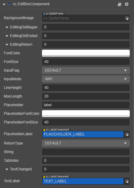
| BackgroundImage | The Sprite component attached to the node for EditBox's background |
| FontColor | The input text color of EditBox |
| FontSize | The input text size of EditBox |
| InputFlag | Specify the input flag: password or capitalized word. (Only supports Android platform) |
| InputMode | Specify the input mode: multiline or single line |
| LineHeight | The input text line height of EditBox |
| MaxLength | The maximize input characters of EditBox |
| Placeholder | The text content of EditBox placeholder |
| PlaceholderFontColor | The text font color of EditBox placeholder |
| PlaceholderFontSize | The text font size of EditBox placeholder |
| PlaceholderLabel | The Label component attached to the node for EditBox's placeholder text label |
| ReturnType | The keyboard return type of EditBox. This is useful for keyboard of mobile device |
| String | The initial input text of EditBox, which displays the text of the placeholder if not set |
| TabIndex | Set the tabIndex of the DOM input element, only useful on the Web |
| TextLabel | The Label component attached to the node for EditBox's input text label |
EditBox Events

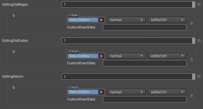
For event structure you can refer to the Button documentation.
- Editing Did Began: This event will be triggered when the user clicks on the EditBox.
- Editing Did Ended: This event will be triggered when the EditBox loses focus.
- When in single line input mode, it's triggered after user presses Enter key or clicks the area outside of EditBox.
- When in multiline input mode, it's triggered only after user clicks the area outside of EditBox.
- Text Changed: This event will be triggered when the content in EditBox is changed each time. However, it is not dispatched if it is set by
setterofEditBox.string.
Detailed Explanation
- If you want to input password, you need set Input Flag to
PASSWORDand the Input Mode mustn't beANY, usually we use Single Line. - If you want to enable multiline input support, you can set the Input Mode to
Any. - The background image of EditBox support 9-slicing sprite frame, you could customize the border as you did in Sprite component.
Add a callback through the script code
Method one
The event callback added by this method is the same as the event callback added by the editor, all added by code. First you need to construct a EventHandler object, and then set the corresponding target, component, handler and customEventData parameters.
import { _decorator, Component, EditBoxComponent, EventHandler } from 'cc';
const { ccclass, property } = _decorator;

@ccclass("example")
export class example extends Component {
    onLoad() {
        const editboxEventHandler = new EventHandler();
        // This node is the node to which your event handler code component belongs.
        editboxEventHandler.target = this.node;
        editboxEventHandler.component = 'example';
        editboxEventHandler.handler = 'onEditDidBegan';
        editboxEventHandler.customEventData = 'foobar';

        const editbox = this.node.getComponent(EditBoxComponent);
        editbox.editingDidBegan.push(editboxEventHandler);
        // You can also register other callback functions in a similar way.
        // editbox.editingDidEnded.push(editboxEventHandler);
        // editbox.textChanged.push(editboxEventHandler);
        // editbox.editingReturn.push(editboxEventHandler);
    }

    onEditDidBegan(editbox, customEventData) {
        // The editbox here is a EditBox object.
        // The customEventData parameter here is equal to the "foobar" you set before.
    }

    // Suppose this callback is for the editingDidEnded event.
    onEditDidEnded(editbox, customEventData) {
        // The editbox here is a EditBox object.
        // The customEventData parameter here is equal to the "foobar" you set before.
    }

    // Suppose this callback is for the textChanged event.
    onTextChanged(text, editbox, customEventData) {
        // The text here indicates the text content of the modified EditBox.
        // The editbox here is a EditBox object.
        // The customEventData parameter here is equal to the "foobar" you set before.
    }
    // Suppose this callback is for the editingReturn event.
    onEditingReturn(editbox, customEventData) {
        // The editbox here is a EditBox object.
        // The customEventData parameter here is equal to the "foobar" you set before.
    }
}
Method two
Added with Node's event API editbox.node.on('editing-did-began', ...).
// Suppose we add an event handler callback inside a component's onLoad method and event handlers in the callback function.
import { _decorator, Component, EditBoxComponent } from 'cc';
const { ccclass, property } = _decorator;

@ccclass("example")
export class example extends Component {
    @property(EditBoxComponent)
    editbox: EditBoxComponent | null = null;
    onLoad(){
        this.editbox.node.on('editing-did-began', this.callback, this);
    }

    callback(editbox: EditBoxComponent){
        // The callback parameter is the EditBox component, note that events registered this way cannot pass customEventData.
    }
}
Similarly, you can register events such as editing-did-ended, text-changed, editing-return, etc. The parameters of the callback function for these events are consistent with the parameters of editing-did-began.
